
More than 200 million people and two-thirds of the 48 contiguous states are at risk from flooding, according to Edward Clark, director of the U.S. National Water Center. This demonstrates the major threat that flooding poses to the reinsurance industry in the U.S. In light of this hazard, the U.S. private insurance market is growing, with 2017 reporting $600 million in premiums, an increase of $217 million over 2016. But why isn’t this figure higher? And, why do approximately 85% of U.S. homeowners lack flood insurance policies?
One of the key reasons, among many, for low private insurance penetration stems from the inadequacy of current flood data, such as FEMA's, to fully assess this hazard.
Changes in landscape
Many parts of the U.S. have experienced extensive redevelopment since the creation of the industry-standard FEMA flood maps, and these redevelopment changes haven’t been adequately captured in flood maps—until now.
To illustrate this, take Sherwood Park in Palm Shores, Florida, which has seen rapid and major development since the 1980s. Areas that were once rural wetlands have been re-landscaped and developed into desirable real estate.
See also: How Non-Standard Became the Standard
Figure 1 shows a historical map of the Palm Shores development in 1981. Palm Shores as an urban area was then confined to the southern part of the area shown, with areas to the north and west entirely rural with several lakes and ponds. This is contrasted with Figure 2, which shows aerial imagery of the Palm Shores development in 2016—an entirely different, more urbanized, landscape today.
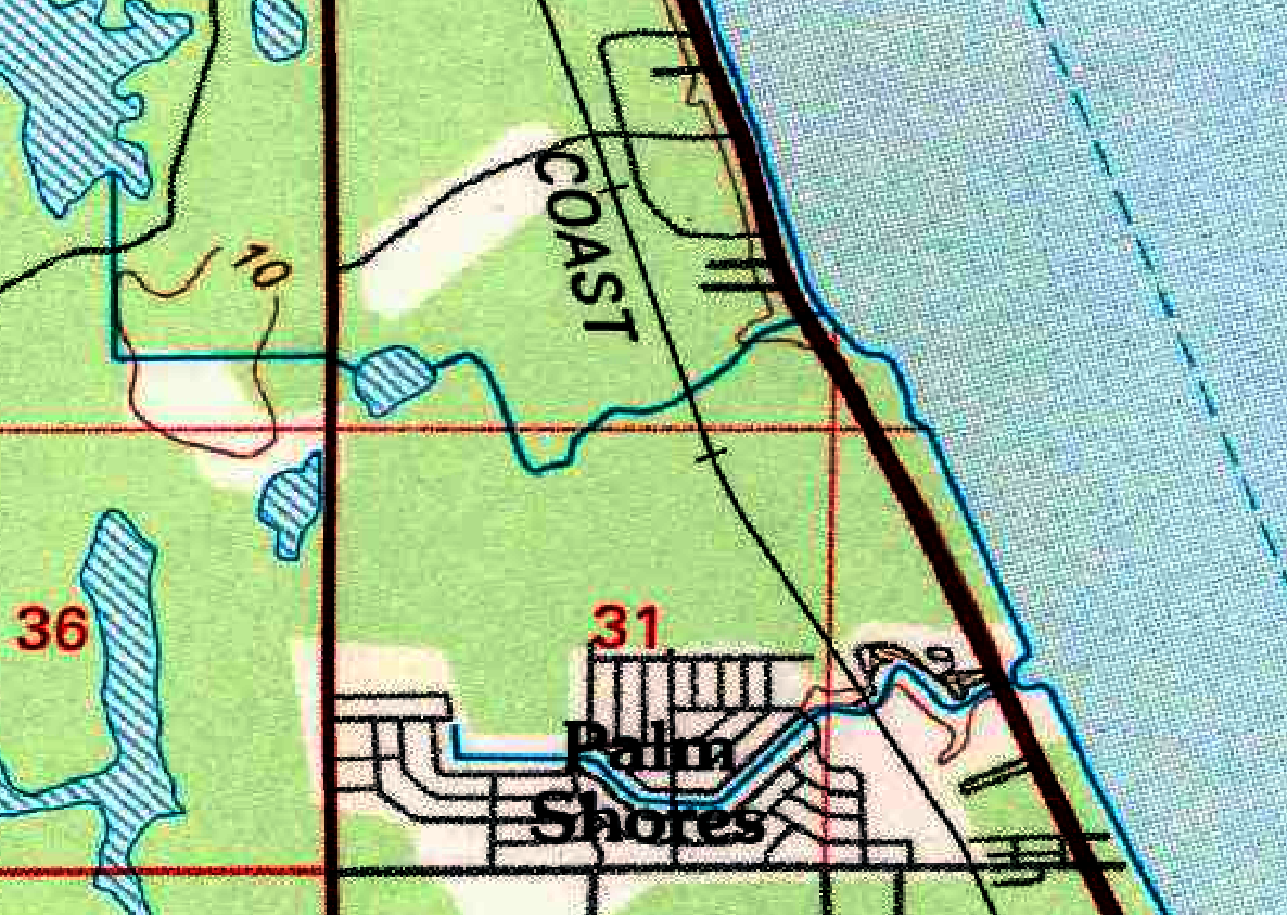 Figure 1: Historical map of Palm Shores development in 1981.
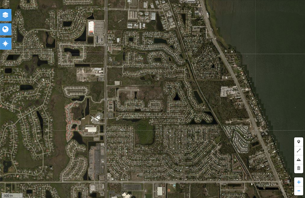 Figure 2: Aerial imagery of Palm Shores development in 2016. This shows an entirely different, more urbanized, landscape today. Basemap: U.S Geological Survey Historical Topographic Map Collection, 1983 ed., accessed via topoView.
Flood maps from the 1980s
To fully and accurately represent today’s flood hazard in these changing areas, it’s vital for insurers to use the most recent flood maps available, which use contemporary, best-available elevation data.
Figure 3 shows FEMA’s flood hazard zones for the Palm Shores area, showing some patches of Zone A flood zones in red, largely restricted to the west. The housing development in the bottom center is Sherwood Park, classified by FEMA as being in a Zone X area of minimal flood hazard.
Figure 2: Aerial imagery of Palm Shores development in 2016. This shows an entirely different, more urbanized, landscape today. Basemap: U.S Geological Survey Historical Topographic Map Collection, 1983 ed., accessed via topoView.
Flood maps from the 1980s
To fully and accurately represent today’s flood hazard in these changing areas, it’s vital for insurers to use the most recent flood maps available, which use contemporary, best-available elevation data.
Figure 3 shows FEMA’s flood hazard zones for the Palm Shores area, showing some patches of Zone A flood zones in red, largely restricted to the west. The housing development in the bottom center is Sherwood Park, classified by FEMA as being in a Zone X area of minimal flood hazard.
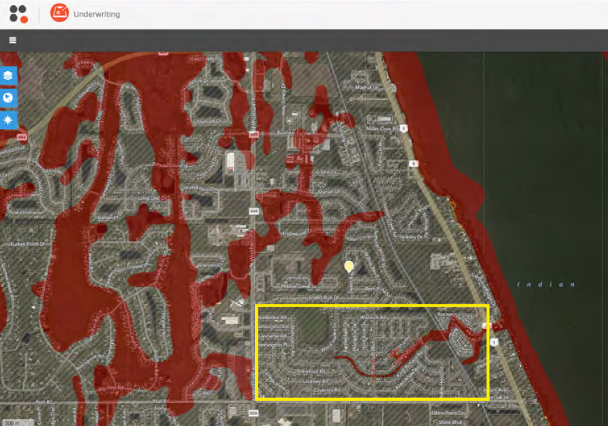 Figure 3: FEMA flood hazard zones for the Sherwood Park housing development, Palm Shores, FL.
Figure 4, on the other hand, shows JBA’s 1-in-100-year flood map, the equivalent of a FEMA Zone A map, which shows a very different picture. The areas of flood hazard are distributed across more of the overall area, with the Sherwood Park area now being represented as flood-prone.
Figure 3: FEMA flood hazard zones for the Sherwood Park housing development, Palm Shores, FL.
Figure 4, on the other hand, shows JBA’s 1-in-100-year flood map, the equivalent of a FEMA Zone A map, which shows a very different picture. The areas of flood hazard are distributed across more of the overall area, with the Sherwood Park area now being represented as flood-prone.
 Figure 4: JBA’S 1-in-100-year flood map, showing areas of flood hazard in Sherwood Park (dark orange indicates more severe flooding). Contains Microsoft® Bing™ Maps, © 2010-2017 Pirmin Kalberer & Mathias Walker, Sourcepole AG.
This disparity in flood hazard mapping can be better understood in the context of the altered landscape. It can be seen that FEMA’s mapping for this area largely corresponds to the landscape of the 1980s rather than the landscape of today. If insurers rely on mapping using this outdated data, they may easily over- or underestimate flood hazard in areas that have experienced redevelopment since the map’s creation.
See also: Hurricane Harvey: An Insurtech Case Study
The need for high-resolution data
This urbanization in areas across the U.S. also highlights the need for high-resolution data, especially when we consider that more than 20% of all NFIP flood claims relate to properties outside FEMA-designated high-risk flood hazard areas.
Figure 5 shows downtown Miami when mapped at 30m resolution (left) and when mapped at 5m resolution (right). The 5m resolution illustrates the flow of water down narrow features such as walkways and roads much more effectively, whereas the 30m mapping can result in under- or overestimation of the hazard.
Figure 4: JBA’S 1-in-100-year flood map, showing areas of flood hazard in Sherwood Park (dark orange indicates more severe flooding). Contains Microsoft® Bing™ Maps, © 2010-2017 Pirmin Kalberer & Mathias Walker, Sourcepole AG.
This disparity in flood hazard mapping can be better understood in the context of the altered landscape. It can be seen that FEMA’s mapping for this area largely corresponds to the landscape of the 1980s rather than the landscape of today. If insurers rely on mapping using this outdated data, they may easily over- or underestimate flood hazard in areas that have experienced redevelopment since the map’s creation.
See also: Hurricane Harvey: An Insurtech Case Study
The need for high-resolution data
This urbanization in areas across the U.S. also highlights the need for high-resolution data, especially when we consider that more than 20% of all NFIP flood claims relate to properties outside FEMA-designated high-risk flood hazard areas.
Figure 5 shows downtown Miami when mapped at 30m resolution (left) and when mapped at 5m resolution (right). The 5m resolution illustrates the flow of water down narrow features such as walkways and roads much more effectively, whereas the 30m mapping can result in under- or overestimation of the hazard.
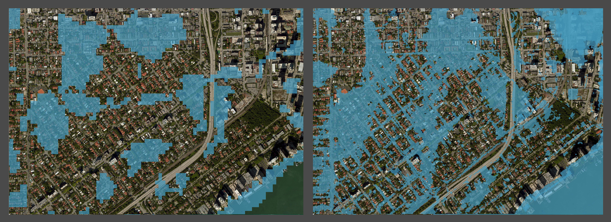 Figure 5: 30m flood map (left) vs JBA 5m flood map (right). Basemap data ©Mapbox ©OpenStreetMap.
In light of these changes in landscape, it’s vital that insurers use the right tools for today’s world. JBA's flood maps include the most up-to-date elevation data and can be used within SpatialKey to help insurers better understand risk in the context of their portfolios for more informed and confident underwriting.
Figure 5: 30m flood map (left) vs JBA 5m flood map (right). Basemap data ©Mapbox ©OpenStreetMap.
In light of these changes in landscape, it’s vital that insurers use the right tools for today’s world. JBA's flood maps include the most up-to-date elevation data and can be used within SpatialKey to help insurers better understand risk in the context of their portfolios for more informed and confident underwriting.
Figure 1: Historical map of Palm Shores development in 1981.
Figure 2: Aerial imagery of Palm Shores development in 2016. This shows an entirely different, more urbanized, landscape today. Basemap: U.S Geological Survey Historical Topographic Map Collection, 1983 ed., accessed via topoView.
Flood maps from the 1980s
To fully and accurately represent today’s flood hazard in these changing areas, it’s vital for insurers to use the most recent flood maps available, which use contemporary, best-available elevation data.
Figure 3 shows FEMA’s flood hazard zones for the Palm Shores area, showing some patches of Zone A flood zones in red, largely restricted to the west. The housing development in the bottom center is Sherwood Park, classified by FEMA as being in a Zone X area of minimal flood hazard.
Figure 3: FEMA flood hazard zones for the Sherwood Park housing development, Palm Shores, FL.
Figure 4, on the other hand, shows JBA’s 1-in-100-year flood map, the equivalent of a FEMA Zone A map, which shows a very different picture. The areas of flood hazard are distributed across more of the overall area, with the Sherwood Park area now being represented as flood-prone.
Figure 4: JBA’S 1-in-100-year flood map, showing areas of flood hazard in Sherwood Park (dark orange indicates more severe flooding). Contains Microsoft® Bing™ Maps, © 2010-2017 Pirmin Kalberer & Mathias Walker, Sourcepole AG.
This disparity in flood hazard mapping can be better understood in the context of the altered landscape. It can be seen that FEMA’s mapping for this area largely corresponds to the landscape of the 1980s rather than the landscape of today. If insurers rely on mapping using this outdated data, they may easily over- or underestimate flood hazard in areas that have experienced redevelopment since the map’s creation.
See also: Hurricane Harvey: An Insurtech Case Study
The need for high-resolution data
This urbanization in areas across the U.S. also highlights the need for high-resolution data, especially when we consider that more than 20% of all NFIP flood claims relate to properties outside FEMA-designated high-risk flood hazard areas.
Figure 5 shows downtown Miami when mapped at 30m resolution (left) and when mapped at 5m resolution (right). The 5m resolution illustrates the flow of water down narrow features such as walkways and roads much more effectively, whereas the 30m mapping can result in under- or overestimation of the hazard.
Figure 5: 30m flood map (left) vs JBA 5m flood map (right). Basemap data ©Mapbox ©OpenStreetMap.
In light of these changes in landscape, it’s vital that insurers use the right tools for today’s world. JBA's flood maps include the most up-to-date elevation data and can be used within SpatialKey to help insurers better understand risk in the context of their portfolios for more informed and confident underwriting.