
No single liability is quite as important to insurers as a best estimate of unpaid claims. It drives earnings reports, shapes financial statements and influences a host of other management decisions. But aberrations in data and model risk often cast a shadow over the reliability of reserve ranges from which this point is selected. Traditional development pattern benchmarks have provided some support in estimating these fundamental liabilities, but, even here, the process has long been a one-dimensional exercise, at least until now.
In determining a central or “best” estimate for property and casualty (P&C) reserves, the goal has never been to zero in on the exact final outcome for an insurer’s ultimate losses but to arrive at an estimate that is as likely to be high as it is to be low. Rather than trying to pinpoint one elusive number, the unpaid claim analysis process has focused on understanding or illustrating the variability around the estimate by identifying a range of reasonable estimates using different methods and assumptions.
By producing other reasonable estimates, actuaries moved somewhat closer to the goal of understanding the full breadth of the possible outcomes, but this approach still lacks specificity and provides little more certainty around an unpaid claim estimate. Commonly used “static” loss development pattern benchmarks that use industry data have been helpful in assessing some of the actuary’s assumptions but not all of them. The lack of specificity in these benchmarks has only marginally improved confidence in the selection of a range and central estimate.
The question is how do you overcome these challenges?
A recently developed dynamic benchmarking tool, which includes percentiles at all stages of development, allows for the calibration of a benchmark that better resembles individual portfolios. As such, this rigorously back-tested tool can provide actuaries an added level of confidence in the reasonableness of any entity’s reserve ranges. This next-generation benchmarking tool, known as claim variability guidelines (CVG), is derived from extensive testing that involved all long-tail Schedule P lines of business and more than 30,000 data triangle sets. Using such an extensive database both:
-
- Provides for the development of a more extensive and reliable benchmark that is much more surgically focused than traditional industry averages.
- Instills greater credibility in the loss development patterns derived for each line of business.
Four real-life scenarios The value of this new benchmarking tool stems from its ability to guide an actuary’s decision-making process by providing an interactive means of comparing the assumptions or estimates from a method or model based on real data and results against comparable alternative assumptions or estimates. To illustrate the potential impact of using such benchmarks, four representative data sets were used from randomly selected companies of four different sizes: A) small, B) regional, C) small national and D) large national. Minor changes were made to the data to protect the identities of each company. For all four companies, the commercial auto line was selected as a common denominator for contrasting the effect of the guidelines for different exposure sizes. To illustrate how useful the guidelines are in practice, a unique variety of lines of business was sampled for each carrier. The accident year earned premiums by line of business for each company are illustrated in Figure 1.
See also: Provocative View on Future of P&C Claims
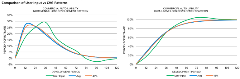
Figure 2, which shows the incremental and cumulative loss development patterns for commercial auto for Company A, provides an example of the type of CVG output that actuaries could use to guide their thought processes. In this case, the incremental loss development from the user’s model shows a pattern that initially might seem to be relatively smooth, but when compared with output from an industry average or the guidelines its irregularities become apparent. For this company, whose loss development pattern is somewhat volatile, using a benchmark pattern other than the average (shown in the “CVG Average Pattern” row) seems appropriate. But which one? 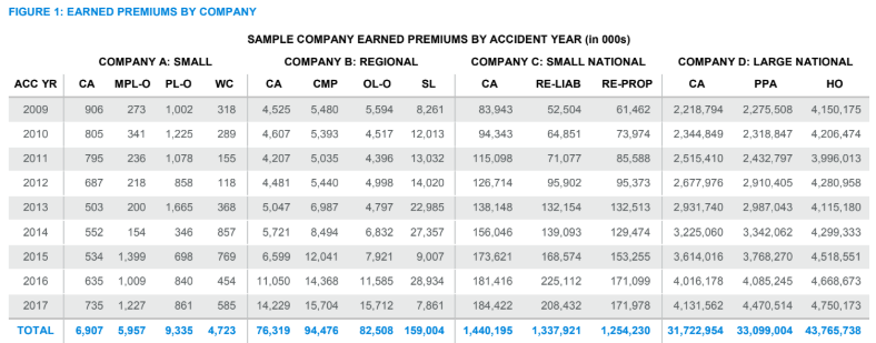
While the guidelines indicate that the 46th percentile (shown in the “Best Fit” row) is the best fit overall, the 46th percentile is less than ideal at different periods, where "best fits" vary from the 13th percentile in development periods 0 to 12 to the 99th percentile in development periods 72 to 108. In fact, there is considerable variability in the recommended fits—a situation that might be expected, considering the data limitations that a small company often encounters. But does the user’s calculated loss development pattern (shown as “User Input ATA Factors” in Figure 2) reflect the company’s uniqueness or contain random noise that could be smoothed by the benchmarks? 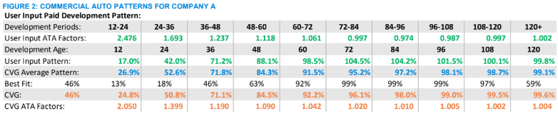
Using the cells in the CVG line, actuaries can select different assumptions and see the impact on their results. Is a dip or bulge in the User Input pattern due to noise, or does it reflect reality? Perhaps the company consistently pays claims faster than the industry average? How different is the mix of business compared with the industry average? Are the User Input Age-to-Age (ATA) factors from 72 to 120 months indicative of salvage and subrogation recoveries that should be included? At any point along the pattern, actuaries can adjust the pattern—using the User Input pattern, the selected guidelines pattern or an alternative—to reflect their understanding of a company’s data. This guided sensitivity testing provides actuaries a way of systematically exploring loss development patterns and deciding how much smoothing is necessary or which pattern is most appropriate. 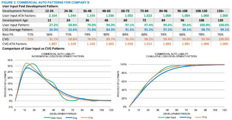
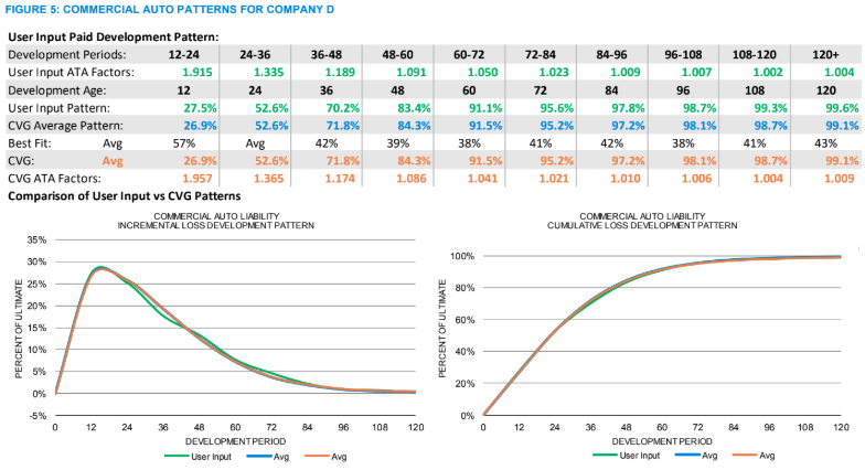
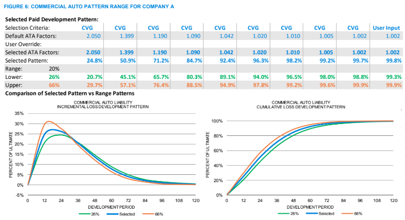
As the exposures increase, the volatility of the calculated loss patterns decreases. For example, the commercial auto loss pattern for Company B in Figure 3 now meanders closer to the best-fit pattern, a situation that is reflected in the increased consistency among the best-fit percentiles (“Best Fit” row). In this case, the best fit is at the 71st percentile. As the patterns calculated from the user’s method and the guidelines move closer together, as is the case for this regional company, the justification for selecting a pattern other than the average increases. By comparing the development pattern graphs in Figures 2 and 5, the difference between the loss patterns calculated from the data and the guidelines merge ever closer for the small national company, as seen in Figure 4, and for the large national company the loss patterns nearly overlay the average, in Figure 5. This convergence of the loss development patterns on the average, interestingly enough, also illustrates how the static average-based benchmarks are most relevant for large national companies, how the various percentiles around the average become more valuable as the exposure size decreases and how both large and small companies benefit from the additional information available in a dynamic benchmark. Once an actuary decides on a loss pattern, a range of reasonable estimates can be established by, for example, using patterns 20 points on either side of the selected loss pattern, as illustrated in Figure 6 below (assuming our best fit is at the 46th percentile and the table sets' lower and upper benchmarks are at the 26th and 66th percentiles). 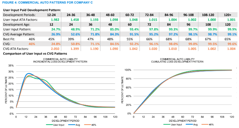
In each of these examples of this next-generation benchmarking process, the estimates for the “normal” weighted results (in Figures 7 and 8 below) were done mechanically using common methods and assumptions to prevent personal biases from masking the potential impact of this process. In practice, this step would be an interactive process, with the guidelines influencing the selection of assumptions and methods and vice versa. For the small company illustrated in Figure 7, the guidelines patterns from Figure 6 are used to estimate unpaid claims to be between 850 and 1,210. This result can be compared with the range and weighted average for the five methods used by the actuary, who now has a supplemental process for deciding on a best estimate. That process includes a new tool for deciding whether any of the estimates in the normal range are unreasonable, e.g., is the lowest estimate in the weighted range reasonable? 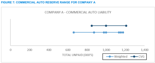
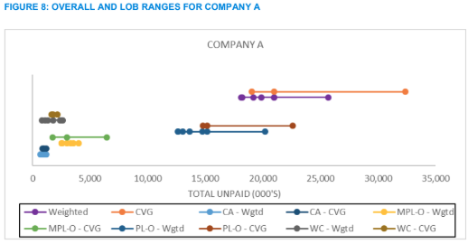
For even the most volatile lines, this process provides a guided method for inquiry and analysis that can lead to greater confidence in the end results. As each line of business is reviewed, they can also be added together to get a view of the overall range for the company, as illustrated in Figure 8.
See also: De-Siloing Data for P&C Insurers
Determining a range of reasonable estimates and a best estimate are fundamental building blocks for assessing the financial health of a company, but they are only a small part of a claim variability process. From benchmarking unpaid claim distributions to setting risk-based capital requirements—topics of subsequent articles in this series—the next generation of benchmarks can help actuaries retool their methods of inquiry and build confidence in the numbers shared with management.