

Inaccurate marketing claims and outcomes reports are proliferating. The Validation Institute has staked out a position as the leader in assisting/promoting vendors and consultants in the “Integrity Segment” of the healthcare services market.
How can you tell if your adviser is in the Integrity Segment? The easiest way: Did they send you to this series, or did you have to find it on your own?
Part One in this series will cover regression to the mean (RTM). That is the tendency of outliers on the high or low side, over time, to come closer to the average. For instance, every season several baseball teams will win or lose all of their first four or five games. Yet, over the course of a full season, no team has ever won more or lost more than 75% of its games. And, over the history of Major League Baseball, no team has won or lost more than 58% of its total lifetime games.
What makes employee healthcare services RTM different from that baseball example (besides being more interesting) is that, while it is very easy to identify and ”count” outliers on the high side who decline in risk or cost, only a handful of consultants and buyers consistently also measure outliers on the low side. As you will see at the end of this article, a small number of vendors will also measure this way. The Validation Institute welcomes vendors who are willing to do that. We also welcome vendors who genuinely believed they were measuring validly, but after reading this article realize that they are inadvertently overstating impact.
Without measuring outliers on the low side, a one-way regression to the mean creates a built-in bias toward showing savings where none exist. Let us first examine this in theory, and then we will present examples of vendors doing this in practice.
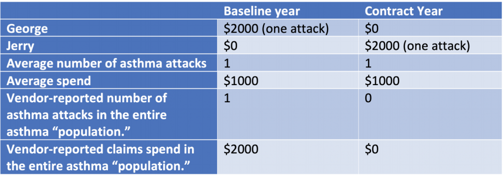
Suppose your company, Vandalay Industries, has two asthmatic employees, George and Jerry. A vendor/carrier proposes an asthma program. George has an asthma attack generating a $2,000 ER visit in the baseline year. Jerry doesn’t; he isn't known to be asthmatic. George qualifies for the program. During the contract year, Jerry has a $2,000 asthma attack. George doesn’t.
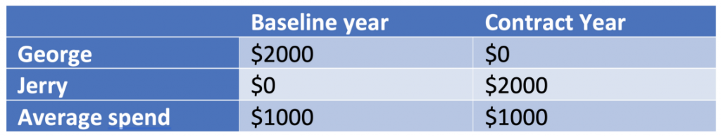
Obviously, no asthma attacks were avoided, and Vandalay Industries saved no money. But that’s not the way wellness/disease management math works.
Here’s why. The vendor doesn’t have to measure Jerry because Jerry didn’t have any asthma-related claims even though he has asthma. Non-validated vendors either don’t know -- or know but won’t admit -- that people like Jerry, who need help but don’t show up in most data extractions, even exist.
Therefore, the vendor only reports on the observed, high-cost George…and
inadvertently or deliberately fabricates improved outcomes and savings for the “population” as a whole -- meaning just George.
Now consider a similar chart, but over four years. Instead of asthma, this is smoking. Instead of disease management, this is a wellness vendor’s smoking cessation program. And instead of asthma attacks, George and Jerry routinely quit smoking and then start smoking again, like many smokers do. In this example, assume they quit/resume every other year. Also assume that, to qualify for a smoking cessation program, you have to be a current smoker, of course.
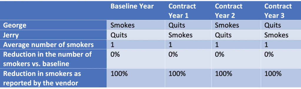
A vendor can keep reporting 100% reductions in smoking every year, even as the number of smokers remains unchanged!
Not just a curious anomaly, this statistical sleight-of-hand has helped to fuel the rise of the wellness, diabetes and other “point solutions” industry.
Let’s consider several examples of vendors and carriers doing this in practice.
So far in this article, we have been careful to acknowledge that some genuinely honest vendors, consultants and actuaries simply don’t understand this fallacy, not having taken our course. The vendors cited below, on the other hand, are quite aware of what they are doing, as is obvious from their own displays, data and statements.
Here is an example of a vendor that “guarantees” a reduction in high-risk members. They don’t say anything about low-risk members increasing in risk.
Oversight? We think not.
If you examine their “bar chart” carefully, you’ll see that they’ve deliberately put the two-thirds of employees who are low-risk into the lowest one-third of the graph, to not draw attention to the fact that the large majority of employees are low-risk. In case you are wondering how they justify this sleight-of-hand arithmetically, count the bubbles. Each bubble represents 10 people.
This is exactly the same fallacy as above, with more realistic assumptions. Just like smokers quit and resume, people gain and lose weight. Blood pressure can go up or down. Bottom line: People change risk levels naturally, wellness program or not.
See also: Bring Certainty to Remote Injury Claims
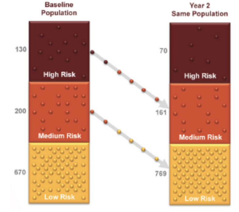
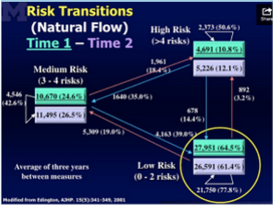
Take a few minutes (and it will take a few minutes) to digest this “natural flow of risk” chart, developed by Dee Edington. (Scroll to Slide #4.) As you can see, absent any intervention, people do fairly predictably change.
Here is how Interactive Health presented this fallacy before the company went bankrupt. The company divided the population into four risk categories and showed how people migrated between the two periods from one risk category to another.
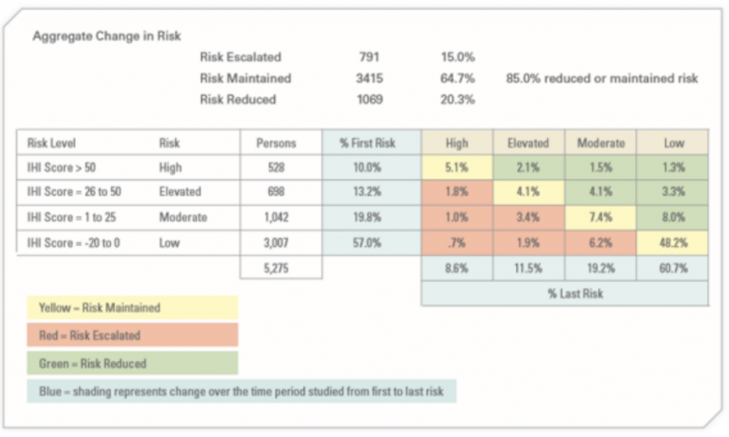
Green improved between the two periods, yellow stayed the same and red got worse. The change between the two periods was mostly regression to the mean, according to their own chart.
You might say: “Well, at least they were being honest.” Haha, good one. Obviously, you are new to the industry. No, here’s what they claimed this chart showed. They said 49% of high-risk members improved, while only 8.8% of low-risk members got worse. True enough. Of the 10% high-risk to begin with, 4.9% improved, and only 5.1% stayed the same. Likewise, their percentages are correct for low-risk members getting worse.
But now consider what really matters—the number of employees, not the percentage. Because very few were high-risk to begin with, that 49% who improved constituted 259 employees. On the other hand, so many employees -- 3,007 -- were low-risk to begin with that the 8.8% who got worse equaled 264 employees. That’s five more than the number who
improved. You would never guess it from those percentages presented.
The Ultimate Perp…Apprehended!
One vendor, Wellsteps, actually admitted to milking regression to the mean, to fabricate savings. As a result, the company and a customer, Boise Schools, won the wellness industry’s highest honor, the C. Everett Koop Award. This was predictable because the award is generally given to people connected to the awards committee. (Boise Schools' CEO had been on it.)
Their many fabricated claims included this one:
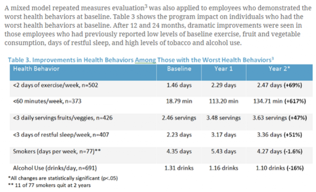
In other words, they cherry-picked the worst employees and showed an improvement in them. Along with the unaddressed curiosity factor of how they conclude that chain-smokers only smoke four or five days a week, this is as pure a regression-to-the-mean play as exists anywhere. Their CEO, Steve Aldana, did admit that, to STATNews, as part of an exposé on their program:
“In just one year, many employees will move from one [risk] group to the other,”[Mr. Aldana] explained,“even though they did not participate in any wellness programs or any intervention whatsoever.”
That movement, he continued,“reflects changes in health risks that occur naturally,” making it possible that some high-risk people become low-risk “even though your program didn’t do anything.”
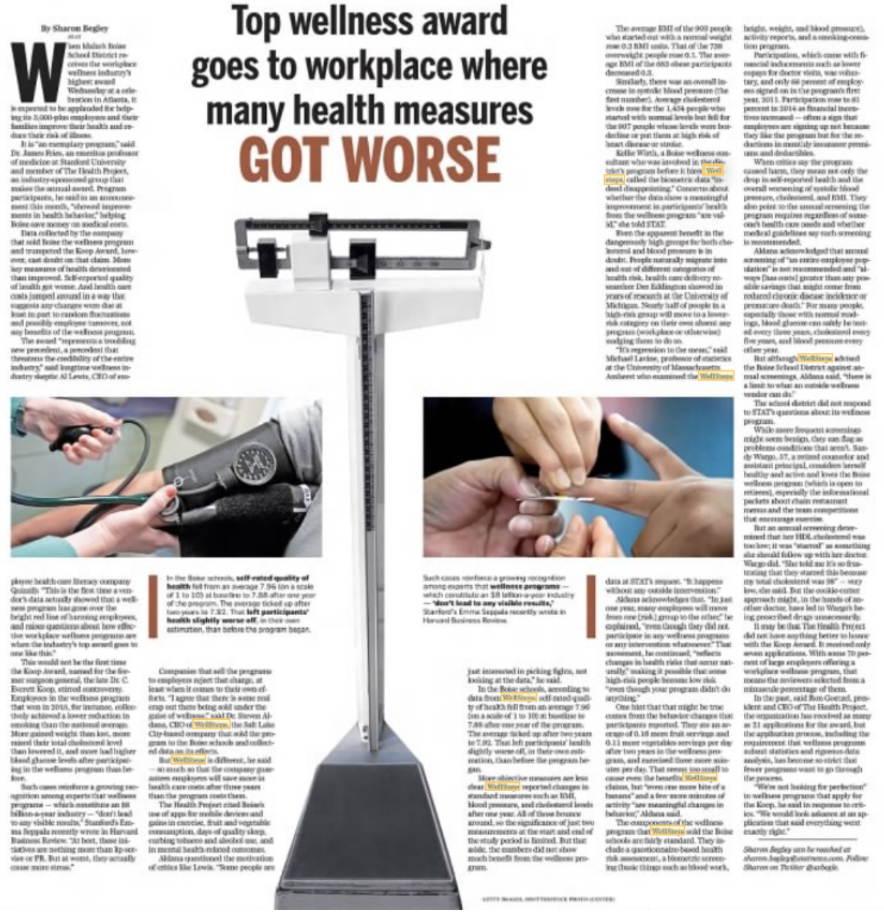
This program may have fooled the Koop Award committee, but it didn’t fool STATNews. Nor did it fool the Boston Globe, which devoted a full-page spread to Wellsteps actually making Boise School employees worse while pretending to improve them:
And now this program shouldn’t fool you.
See also: Gateway to Claims Transformation
The Take-Aways
Lessons from this first installment include the following:
First, any vendor whose pitch includes: “We manage your highest…” should immediately be told to go get validated by the Validation Institute (VI) for that claim and then come back later. The honest ones will follow up. The others? This will be the last you hear of them. If a vendor includes anything like this pitch in their outcomes report, demand a refund. Those vendors are fully aware of the fallacy.
Second, dismiss any claim that compares percentage of improvers to percentages who get worse. It’s all about the absolute numbers.
Third, every VI-validated vendor offers a metric that controls for regression to the mean. (This isn’t to say this control is required as part of validation. It is merely required to be offered. You may not have the data to take the vendor up on the offer.)
For instance, U.S. Preventive Medicine specifically measures its risk reduction against that which would happen naturally. Cecelia and Virta are the only diabetes vendors that will allow you to contract for a simple comparison of the number of uncontrolled diabetics year over year across your population. These vendors avoid both regression bias and
participation bias. The latter is another huge fallacy to be covered in our next installment.
Finally, please enroll in both our Critical Outcomes Report Analysis (CORA and CORA Pro) courses, which cover these and other fallacies. It is especially important to urge your consultants and brokers to enroll, as you are paying them to protect your interests, but the proliferation – even the continued existence -- of these fallacies strongly suggests they aren’t.